 My colleague at Microsoft Research in Cambridge, Martin Calsyn recently unveiled the second project we are working on at the Computational Science Laboratory at Microsoft Research in Cambridge, UK. The Microsoft Visualization Language codenamed Vedea is an experimental language for creating interactive infographics and data visualizations. The language initially targets non-programmers, however, Vedea also provides sophisticated features such as LINQ for experienced developers as Martin demonstrates in his post.
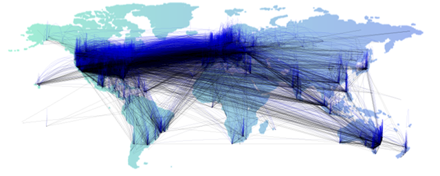
Vedea was demoed the first time at PDC09 to the public. The demo shown there visualizes global IP traffic monitored during a 24h time span. The data is organized in a standard CSV file and contains source, destination, geographical coordinates, IP numbers and the time and some more statistical information.
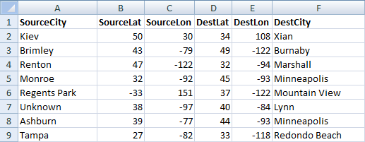
The data itself is rather unspectacular and the most useful for some statistical analysis. However, with Vedea is is relatively easy to visualize the data in a handsome manner. Before you go on, please be aware that the language is still under development and the given example just represents the state of development at the time of PDC09.
img = LoadImage("world.png");
Scene.Add(new Vedea.Image(img, 0, 0));

for (i=0; i<len; i=i+1) {
  b = Noise(i*255);
  Stroke(20, 0, 0, b);

  x1 = csv.SourceLon[i];
  y1 = cvs.SourceLat[i];
  x2 = cvs.DestLon[i];
  y2 = csv.DestLat[i];
  c = new Vedea.Curve(x1-10, y1-b, x1, y1, x2, y2, x2, y2-b);
  Scene.Add(c);
}
The fist two lines of code are used to load background image. after loading, the image is added to the current scene. The Scene object describes the standard canvas, the programmer draws on. This demonstrates the object oriented capabilities of Vedea. As Vedea is a dynamic language which is based on the DLR, there is no need to declare the type of the image object.
At the next lines we find a simple for-loop that iterates through all lines of the source data. The data file has been loaded similar to the image beforehand into an data file called csv and len is a value of roughly 100.000. So yes, we draw an manage about 100.000 primitives here. Most of the language features in Vedea can be used in a imperative or declarative way. Noise for example is a built-in language features that returns a random number (between 0.0 an 1.0) based on a one-dimensional Perlin noise function. This function is used to create a smooth color gradient with a alpha channel of 20 for our visualization.
 Stroke is used in a declarative way to set the stroke color for all primitives drawn afterwards. The next four lines simply read the x- and y-coordinates Finally, a curve is drawn and added to the current scene. The fist and the last point specified are control points that determine the curve’s flexure while the second and third point describe the actual start and endpoint of the curve. Of course the Curve primitive can be used in an imperative or declarative style (or both) as well:
Stroke(255, 0, 0);
Scene.Add(new Vedea.Curve(5, 26, 5, 26, 73, 24, 73, 61));
Stroke(0, 0, 0);
Curve(5, 26, 73, 24, 73, 61, 15, 65);
Stroke(255, 0, 0);
Curve(73, 24, 73, 61, 15, 65, 15, 65);
In the original example we use the previously generated random value b also to vary the curves control points corresponding with the color. Once we run (remember, we are based on the DLR and thus we don’t compile) the example, we finally get our visualization.

In his post Nick Eaton stated that
“Users of Vedea obviously need to have some background in coding.”
This is not necessarily true as the example above should show. Using the declarative style of the language it is relatively easy to create appealing visualizations with only little knowledge about programming structures and technologies such as DirectX, GDI+ or WPF. As seen in the example above its within the nature of Vedea to forgive various mistakes which makes it easy to use from the very beginning.
Vedea is a research project of the Computational Science Laboratory of Microsoft Research in Cambridge, UK. The project and still under development. The example shown here represents the state of the project at the time of PDC09 as it was presented to the public. As this is an ongoing project the language might evolve, new features will be developed and others might become obsolete.
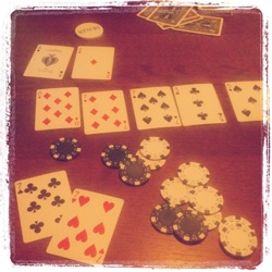 During yesterdays game, we had a great hand facing a pocket pair of sevens a pocket pair of aces. By the flop and turn two more sevens came up providing me four of a kind and eventually the pot. Afterwards we had a nice chat about when and how to play a pocket pair as with three or less players on the table, one would play a pocket pair to the very end most of the times. However, with yesterdays hand in mind, I was quite interested in the statistics and the probability, my opponent might have a larger pair than 77.
 My colleague at Microsoft Research in Cambridge, Martin Calsyn recently
 Stroke is used in a declarative way to set the stroke color for all primitives drawn afterwards. The next four lines simply read the x- and y-coordinates Finally, a curve is drawn and added to the current scene. The fist and the last point specified are control points that determine the curve’s flexure while the second and third point describe the actual start and endpoint of the curve. Of course the Curve primitive can be used in an imperative or declarative style (or both) as well: