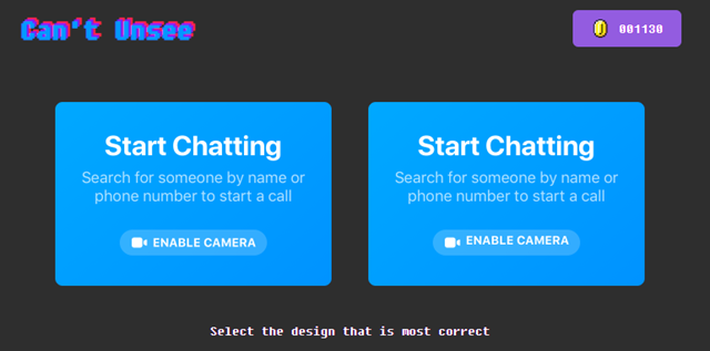
In my recent lectures about interactive systems, I talked a lot about standards and guidelines for visual design. When I learned about Can’t Unsee,I had to share this with my students at once. It is a little game where you can learn quite a lot about the details of visual design.
It shows you two alternatives of designs differing only in a few or even one detail. The further your get, the harder the challenge becomes. While the differences are obvious in the beginning the details are getting harder to realize by time.
I can y recommend to play this little game, if yo want increase your sensibility to the little details of visual design.
Link: https://cantunsee.space/
